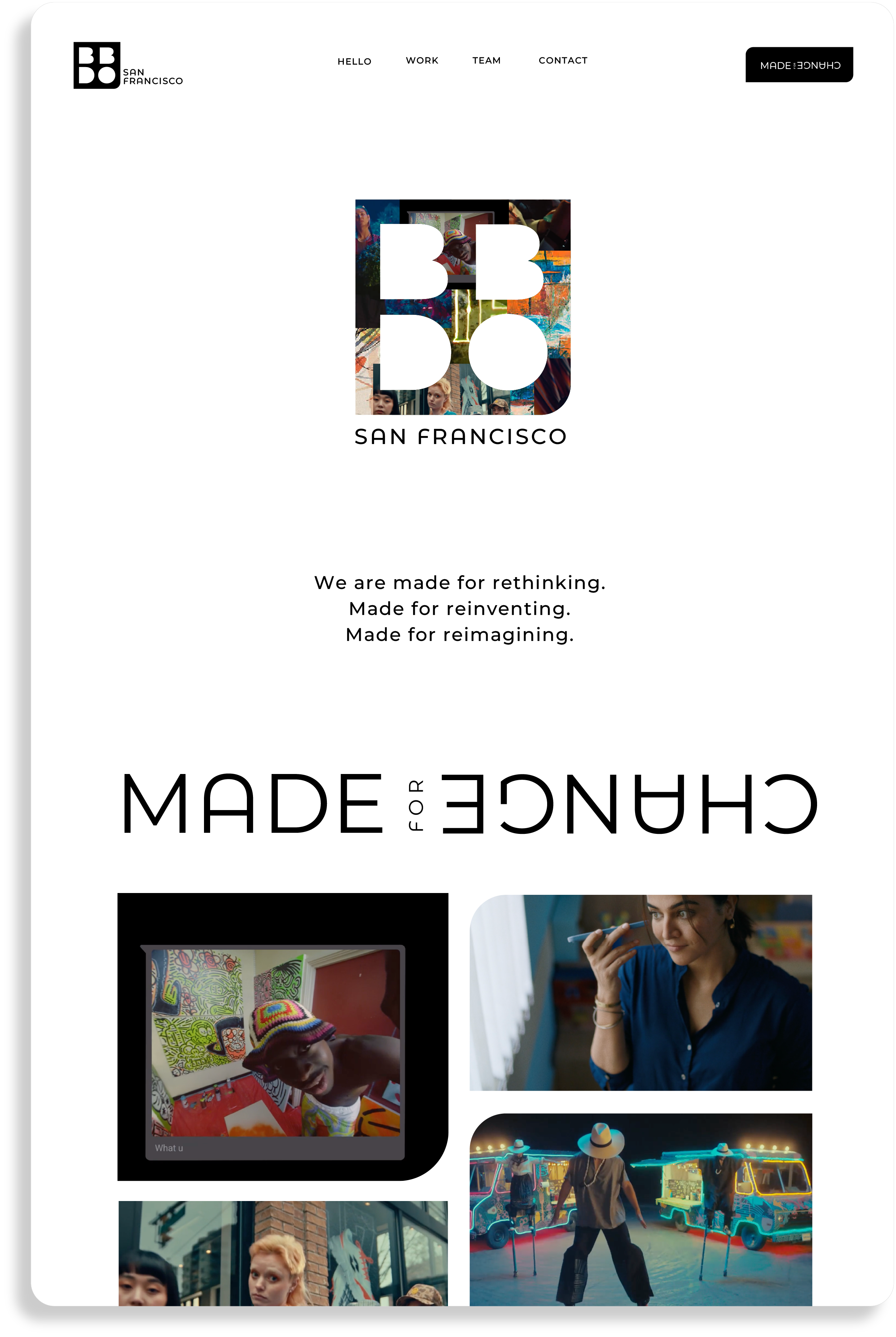
BBDO SF
I spearheaded the design of our new brand positioning, MADE FOR CHANGE, at BBDO SF. As the lead designer, I collaborated closely with the team throughout the research and strategy phases, then led the visual development to bring our brand vision to life.
Preliminary logo exploration
Throughout the exploration process, we prioritized ensuring the new logo integrated with BBDO’s global brand identity while reflecting a unique spirit of change specific to our office, BBDO SF.

Final Logo
The final logo was selected for its versatility in setting the stage for our ever-evolving content.
Leveraging its similarity to Gotham, BBDO’s legacy typeface, we selected Montserrat for our brand. This ensures compatibility with the larger BBDO network while maintaining accessibility with Google Slides for collaborative projects.


Tagline Lockup

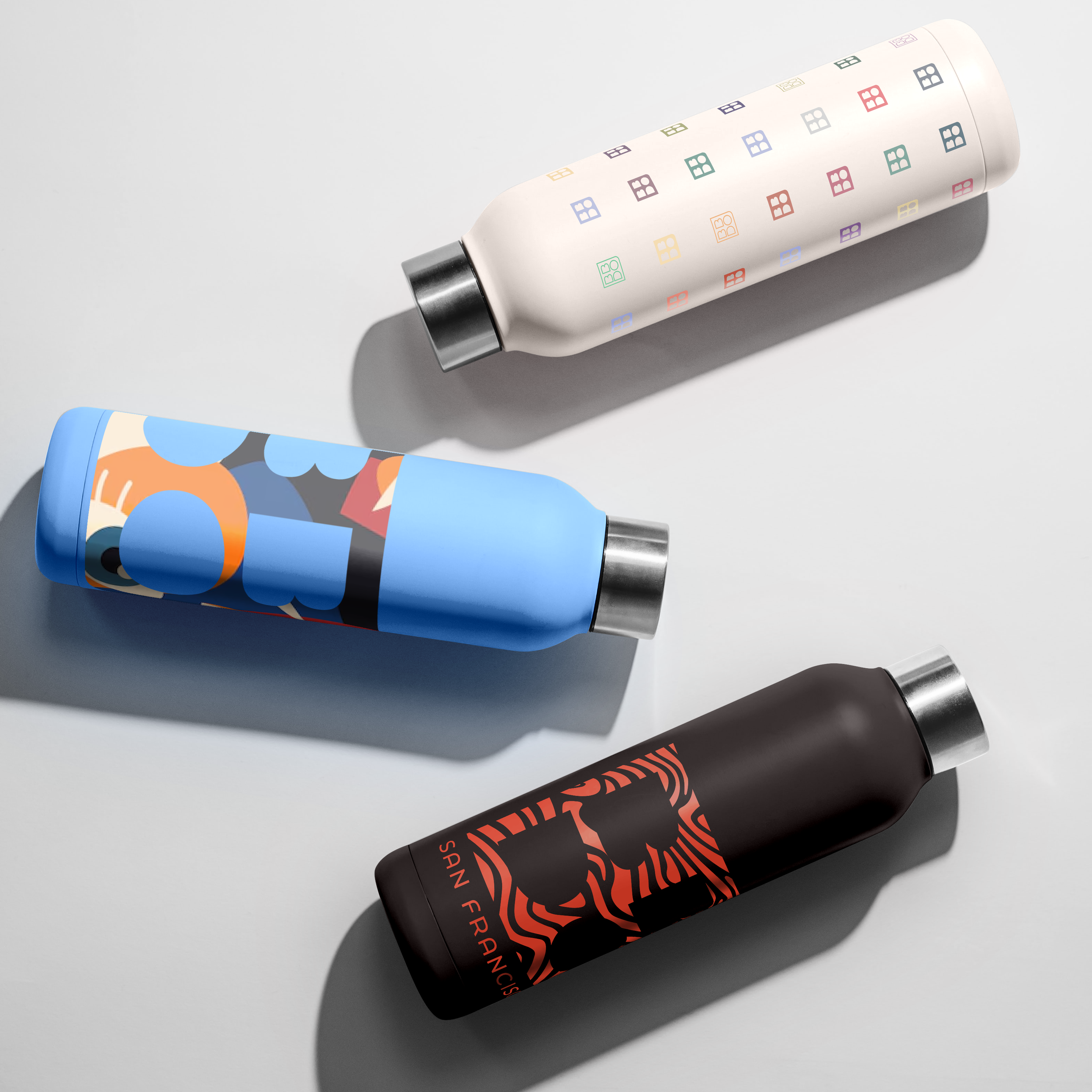
Shape Language
We leveraged the inherent shapes and forms within our logo to create a dynamic visual language for the brand. This system allows for modular components that can be combined and transformed to create unique visuals for any moment.