Chi Chi’s Salsa | Branding
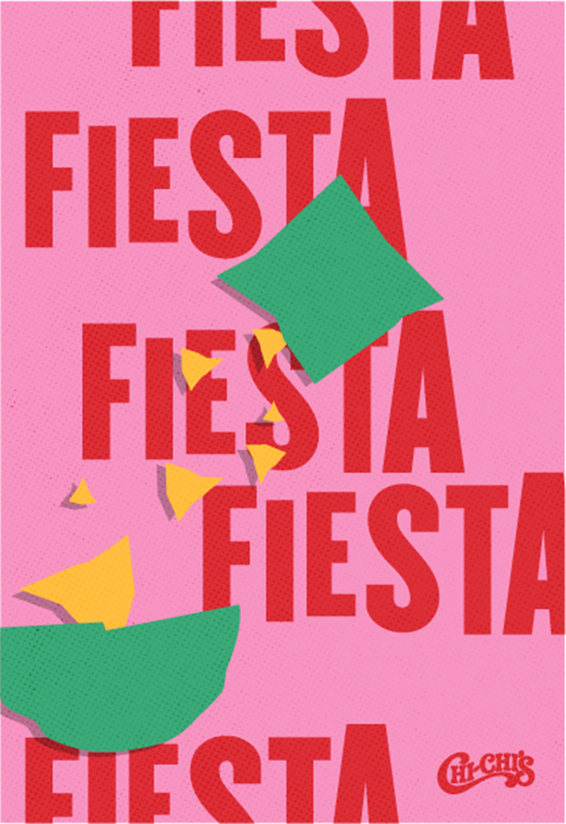
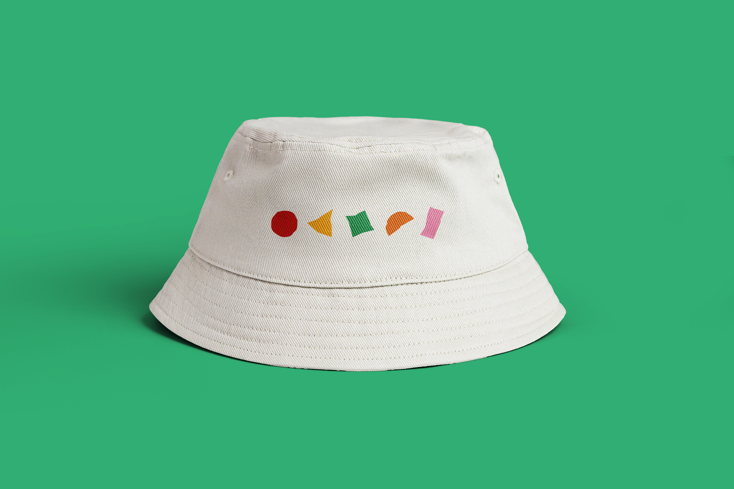
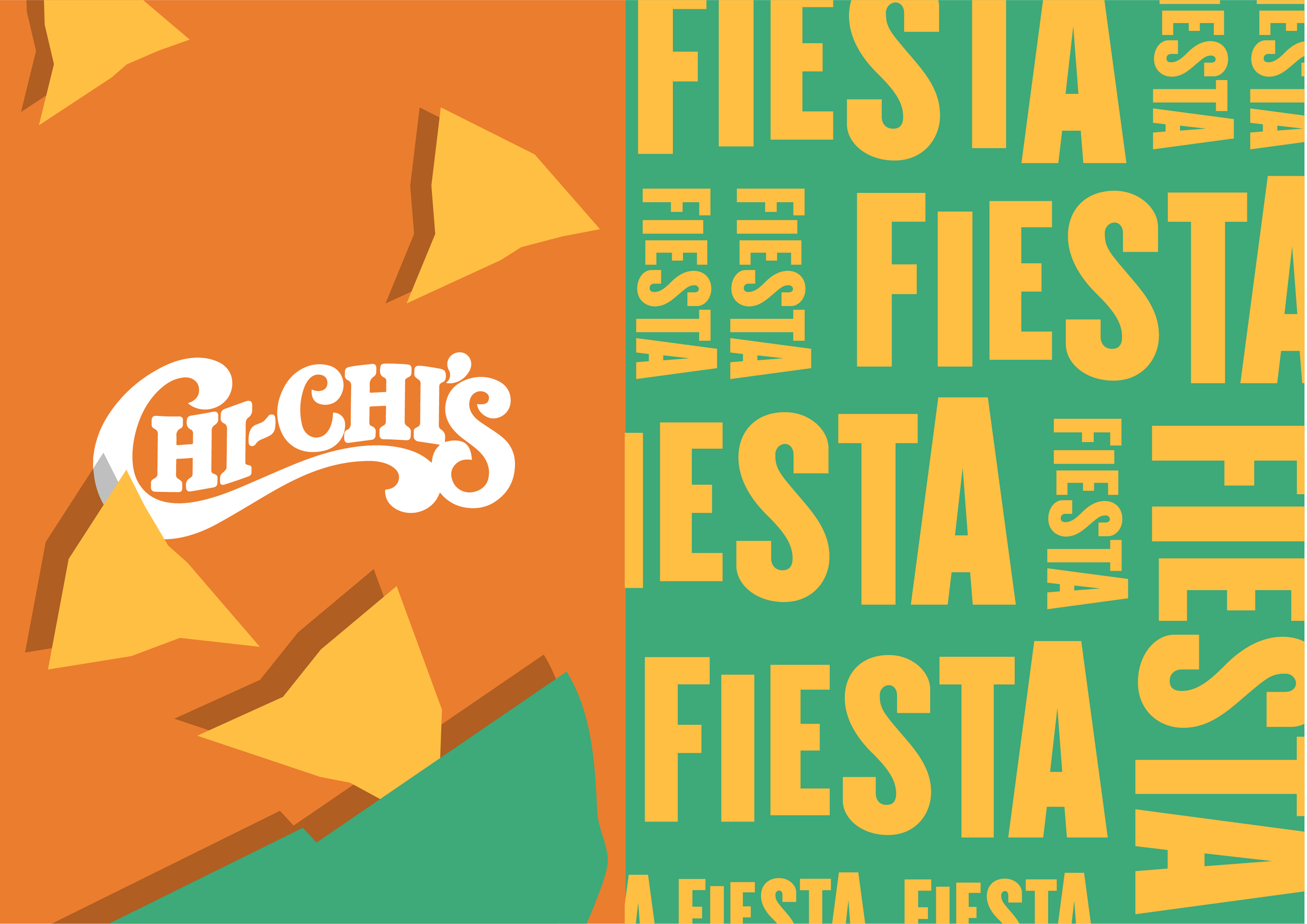
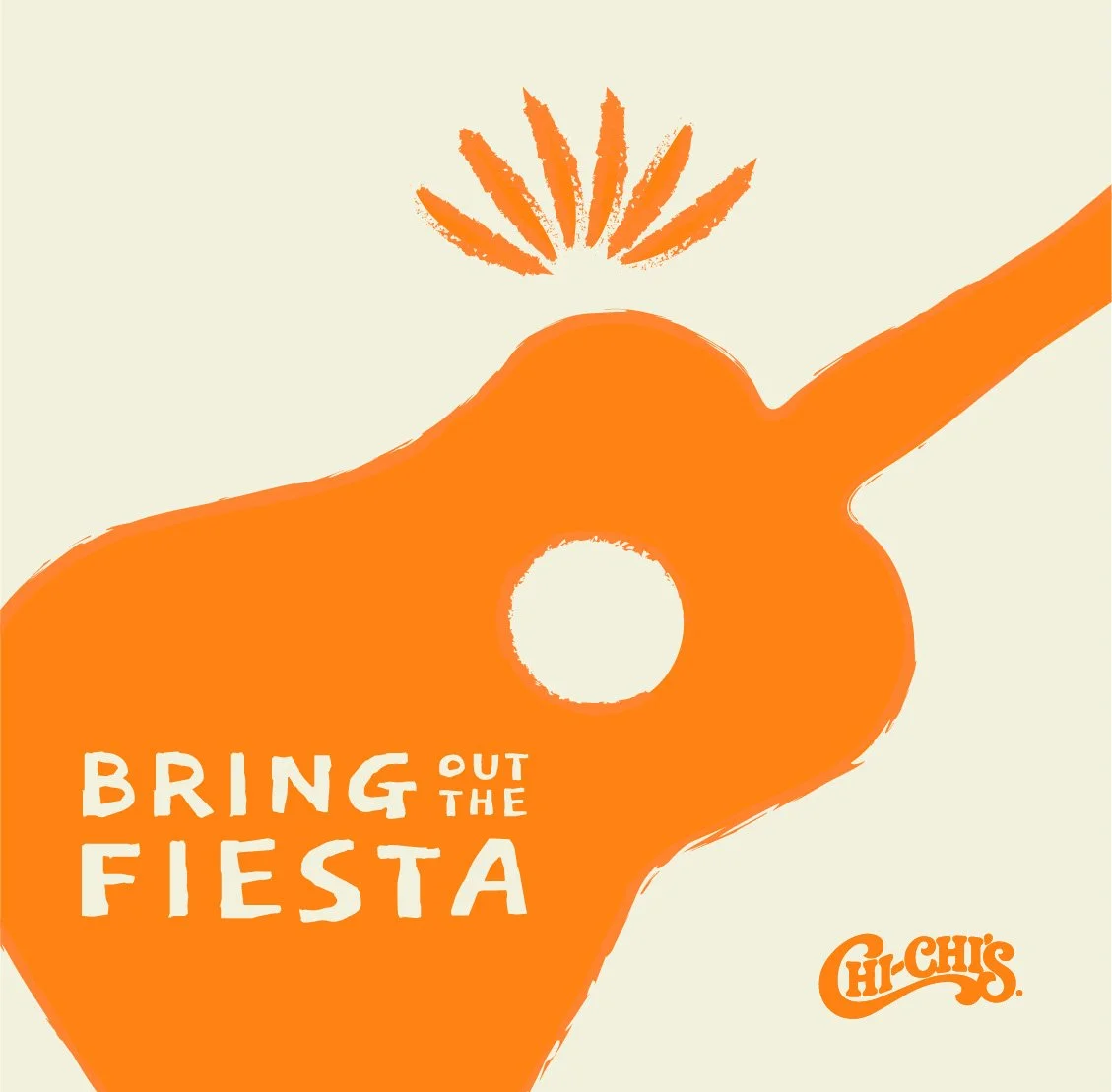
Chi Chi's Salsa ignites the party with "Let the Fiesta Begin!" I was the lead designer helping our team create new branding, designed for pure fun, using just five simple shapes to evoke the spirit of celebration and delicious food. This versatile approach allows Chi Chi's to easily adapt the branding to future campaigns, keeping the fiesta fresh and exciting!
Preliminary Explorations
During our exploration, we examined a range of design styles, from representational to abstract. The client appreciated the variety, and we ultimately chose a style that could be flexible and accommodate both approaches.


Final Design System
Drawing inspiration from papel picado, a Mexican art known for its intricate cut-out tissue paper designs, these five friendly shapes serve as building blocks for creating the brand's visuals.


Typography
In the typography, we aimed for a playful spirit, letting the letters break free from convention and dance across the page.